Visualizations are Powerful, But Often Misleading


Powerful data visualization can demonstrate in the blink of an eye what might take minutes, or even hours to uncover through reading and analysis. The power of visualization lies in the ability to quickly relate thousands or even millions of data points thereby conveying their meaning.
Each part of a visualization implies something. Very often I will plot lines. Depending on the nature of the visualization, meaning is conveyed by the slope or height of the line. A line whose values are increasing might show income increasing over time. Or, area under a curve might convey distance traveled if the units represented by the line are meters per second.
Very often, I will transform data to help clarify its meaning. In economics, it is common to take the logged value of data that is generated over time because logged values allow you to compare proportional change from one unit of time to the next. Suppose that your speed is consistently increasing so that it doubles every 10 seconds. Or imagine that your income doubles every year. Very quickly the value represented by the line will become quite large.
This is exemplified by a tale about the origins of chess. A king offered to reward the creator, who cleverly asked for a gift of rice (or wheat depending on the rendition) where for each square on the chess board, the number of grains would double, from 1 to 2, to 4, eventually reaching 263. Very quickly the king learned that he had failed to account for the magnitude of the gift! If we were to log the vertical axis to represent the story, the line used to represent the number of grains of rice for each additional square would be straight instead of becoming a rather steep curve. The slope of the line would approximate change as a percentage from one period to the next.
COVID-19 Data and Rules of Thumb for Visualizing Data
As with any tool, visualization must be used responsibly. Tools for visualizing one type of data may not be appropriate for another. If I was to graph the speed of a car over time with the goal of indicating distance traveled, it would make little sense for me to log the vertical axis. For example, when I generate statistics for data, I do not log interest rates or estimate the percent change of an interest rate. I do calculate logged values and percent change for variables that are levels like real GDP and the quantity of dollars circulating in the U.S. economy.
To make improper transformation of data can lead observers of data to incorrect conclusions. As COVID-19 data has proliferated since the start of the year, I have observed time and time again individuals who present the data incorrectly. To name one pernicious sin, comparisons of the total number of cases or deaths between countries or between counties in the United States convey little to no information that is useful for comparing the state of spread in each entity. If the goal is to make inferences from comparison of data from different jurisdictions, then the data needs to control for population.
You must also consider the nature of a set of data. For example, even controlling for population, it makes little sense to compare the level of positive COVID-19 cases in countries that do not have comparable capacity to provide testing. The number of tests per million in the United States is going to be much higher than the number of tests per million in Afghanistan. These problems have been pervasive.
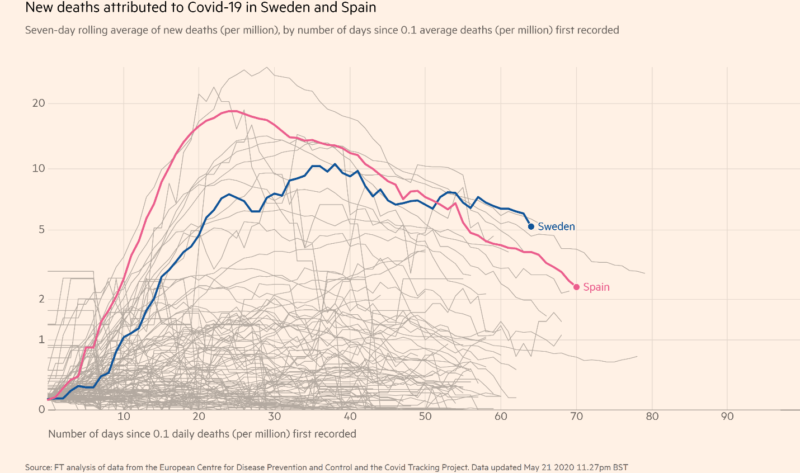
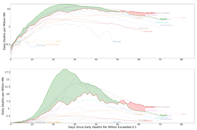
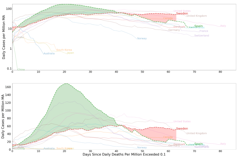
Today, I was surprised when I saw a new problem in the presentation of data concerning the state of the spread in Sweden. The Financial Times indicated that the daily number of deaths per million per day in Sweden recently passed that of Italy, UK, and Belgium. The article includes a graphic comparing the UK and Sweden and links to a graphic comparing Spain and Sweden. Both visualizations used a logged y-axis to compare values that are already rates of change. As I have noted, the area under a curve indicates the accumulation of value over time in plots where the rate of change is indicated on the vertical axis and time on the horizontal axis.
If you log values represented by the vertical axis, this compresses the areas that are relatively large and expands the areas that are relatively small. The takeaway from the Financial Times article is somewhat ambiguous. The author does not take a hard stance one way or the other. The undertones of the article, however, are not ambiguous. This may not be the intention of the author, but the subtle details convey much.
The title of the article informs the reader that “Sweden’s death toll unnerves its Nordic neighbors”. It cites data concerning differences of new deaths per million each day between Sweden, the U.K., Spain and Italy, but does not compare levels. It compares the level of total deaths per million in Sweden with the levels of its neighbors, Netherlands, Denmark and Norway.
The article cites a politician from Denmark who is quite concerned:
“I don’t believe that Denmark should open its border to Sweden already because the COVID-19 situation is still out of control in Sweden. Denmark has to await a normalisation in Sweden. So this is a rational decision based only on the number of COVID-19 deaths,” Peter Skaarup, parliamentary head of the populist Danish People’s party, told the FT.
The perception among some in neighboring countries is that Sweden has adopted an extreme, and perhaps dangerous, policy.
I don’t know exactly the sentiment that Sweden’s neighbors in general hold toward its policy. The article may be truly representative on this front. However, I think it is appropriate to convey all of the facts, not just the negative. In this spirit, I offer the reader visualization comparing Sweden with other countries, highlighting Spain in particular. I present the data with logged vertical axes and unlogged vertical axes.
In the plots with unlogged values, the area beneath the curve represents the total number of COVID-19 related deaths in a country. The area highlighted between curves represents the difference between Spain and Sweden. The reader will notice that the logged plots understate the level of deaths (area under the curve) for Spain relative to Sweden.
Sweden has flattened its curve without a lockdown on the presumption that the number of deaths that will result from its strategy will be on par with the number of deaths that would occur with a lockdown. Sweden’s strategy has received praise from the WHO, but has received harsh criticism from some experts within the country. Only time will tell if this assumption is correct.
My best guess – I am an economist, not an epidemiologist – is that we will not have the data necessary to judge until we see later waves of the spread. The epidemiologists that lead policy in Sweden are confident that their approach is the correct one.
In light of my own preferences, I must recognize at least a few facts. Sweden’s policy is not to minimize the rate of spread. Their goal is to make the spread manageable, thereby limiting unnecessary loss of life. South Korea, on the other hand, has shown that a program of tracking from the earliest days of the spread is actually quite efficient at slowing the spread.
There is no comparison to the success that we’ve seen across Southeast Asia in slowing the spread.I’m more than a bit uncomfortable with a strategy that uses involuntary tracking to slow the spread, but its success is impossible to deny. Is the potential loss of liberty from growing surveillance worth bearing?
And although Sweden seems to be doing relatively well in light of the fact it has not locked down, it is being outperformed in terms of the level of deaths per million by a number of its neighbors who did lock down. Only time will tell if the end state will be different once a year or more has passed.
I also cannot hide that I am suspicious of policies that threaten liberty in the long-run and that appear to me to disrespect protections to our civil liberties provided by the U.S. Constitution. I’m uncomfortable with the fact that the virus has made us suspicious of one another. I look forward to a time that society returns to a higher level of openness.
I accept that a return to normalcy is part of democratic conversation that occurs fundamentally at the local level, and that many believe that every possible effort must be made to maximize the flattening of the curve. I must respect the concern of those around me. Most in the U.S. do not support a Sweden-type of policy. I notice also that most are not comfortable discussing policy options.
While my interest drives the subject of my analysis, it should not categorically drive outcomes. I believe that democracy depends on a willingness to engage openly with ideas that challenge our fundamental beliefs and strongest preferences. If there exist a set of ideas that is strongly supported by evidence and that is at odds with my own beliefs, in the least I must respect the strength of the position, if not accept it altogether. I would be dishonest to do otherwise.
And, no matter my position, the data must be allowed to speak without being distorted. I leave it to the reader to interpret what it is saying.
James L. Caton

James L. Caton is an Assistant Professor in the Department of Agribusiness and Applied Economics and a Fellow at the Center for the Study of Public Choice and Private Enterprise at North Dakota State University. His research interests include agent-based simulation and monetary theories of macroeconomic fluctuation. He has published articles in scholarly journals, including The Southern Economic Journal, the Journal of Entrepreneurship and Public Policy, and the Journal of Artificial Societies and Social Simulation. He is also the co-editor of Macroeconomics, a two-volume set of essays and primary sources in classical and modern macroeconomic thought. Caton earned his Ph.D. in Economics from George Mason University, his M.A. in Economics from San Jose State University, and his B.A. in History from Humboldt State University.