Longer Lockdowns Associated with Much Worse Economic Outcomes


This week’s second-quarter advance estimate of GDP showing the most severe projected contraction on record has led to speculation as to what exactly made the United States economy contract so much, and if this contraction was avoidable. The two obvious effects analysts would like to tease out are the relative impacts of voluntary and involuntary reductions in consumption and production, particularly in the service industry.
A significant voluntary reduction in consumption–people staying home, shifting to remote work, and taking their kids out of school—occurred before the cascade of shelter-in-place orders and restrictions on assembly and certain businesses. Will Luther has written on the voluntary reduction in consumption and production prior to the institution of lockdowns, and in states where there were no lockdowns. Additionally, many businesses and particularly services temporarily closed shop—ceased production—before the lockdown orders.
But it’s obvious that if you restrict and ban certain businesses, they will suffer for it. Some business owners who made it through the first wave of lockdowns are saying their businesses won’t be able to survive another. This isn’t rocket science. Perhaps businesses do need to adapt to better serve their customers during this time, but they cannot do so if they are restricted or banned from operation completely and indefinitely. They can keep paying their fixed costs—rent and bills and taxes—until they can’t, anymore. Most small businesses in particular don’t have the kind of generous margins to last through one lockdown, let alone two or more.
We also don’t know how businesses might have adapted to keep themselves afloat while harmonizing their services with the safety needs of their customers absent lockdowns. Now that the economy has been largely open since the beginning of June, we’ve seen many adaptations: social distancing is the new norm, as is mask-wearing, particularly by employees in the absence of a mask mandate. Many businesses also require their employees undergo fever checks, and New York University stated recently that it will require its employees to submit negative results of a COVID test before being allowed back on campus.
Though the voluntary reduction in consumption and production started before lockdowns, we would like to get a sense for how much of the overall GDP contraction was due to an involuntary reduction in consumption and production. The hypothesis is that business restrictions attenuate the drop in consumption and production beyond the point where it is no longer viable for a business to remain closed, or where the demand for restricted products and services has increased from its voluntary drop but cannot be met.
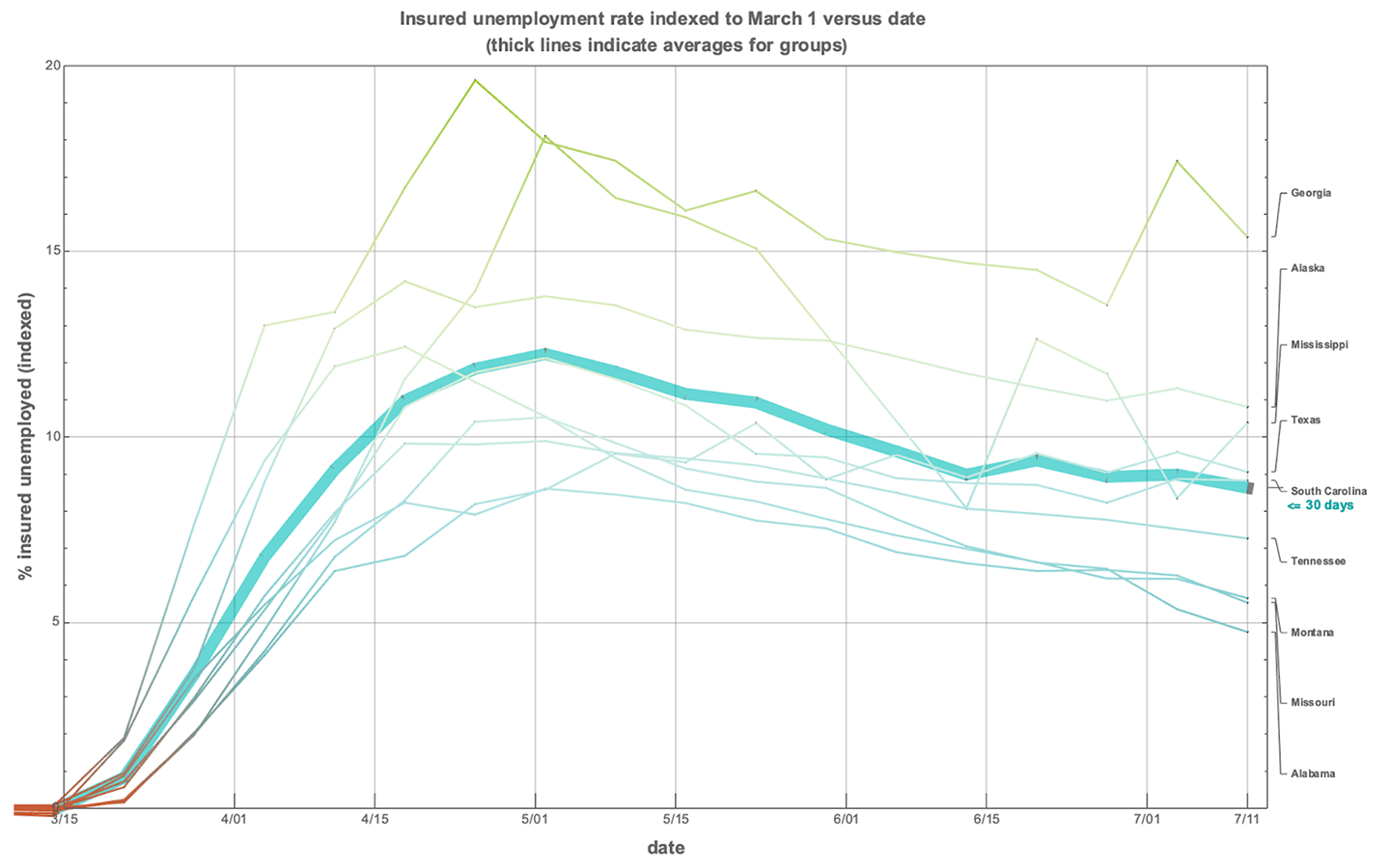
I’ve written about how insured unemployment has progressed depending on a state’s lockdown status. Now that the first wave of lockdowns has been phased out in the vast majority of states, we can get a sense for whether or not the length of the lockdown is associated with the insured unemployment rate of each state, using that metric as a proxy for economic health. I calculate the actual start and end dates of statewide lockdowns, and associated the “end” with whatever phase lifted most restrictions on conducting any given type of business activity. That is, many states still have capacity restrictions for services, masking mandates, and other kinds of testing mandates.
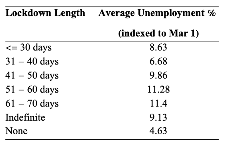
The graphs below show the insured unemployment rate indexed to 0 for each state at March 1 (the data are available at BLS.gov). The latest data reflect numbers up to July 11, 2020. I categorize states simply based on the lengths of their lockdowns, then average over that category. For states that did adopt some kind of lockdown order—and all but six states did—the shortest lockdowns were between 24 and 30 days, and then I split the categories by 10-day chunks. The longest lockdowns were between 61 and 70 days.
Before showing the graphs, here is a summary table of category averages by July 11, 2020.
The first graph shows all the lockdown-length categories on one graph, with the averages for those categories over time illustrated using bold lines. Individual state trends are also shown, in lighter and thinner lines the same color as their category. I break the categories down into their component states in graphs further down.

The most interesting thing about the graph above isn’t that longer lockdowns were associated with higher rates of insured unemployment—though that does suggest lockdown length has something to do with the economic pain states currently experience—but that the shortest lockdown category, between 24 and 30 days, is associated with a higher insured unemployment rate than the next-shortest lockdown category, and fairly consistently.
Next, let’s break down each group and look at how the states fare within their group. First, we consider the case of states that had no formal shelter-in-place orders (note that Arkansas did have business restrictions though it had no formal shelter-in-place order):
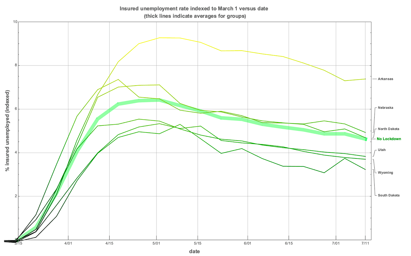
Next let’s consider states whose lockdowns plans didn’t have firm end-dates but rather whose phase movements would be up to the decision of the governor, states with “indefinite” lockdowns. You’ll see that California is pulling this group’s average up, with an insured unemployment rate of 13.3% (indexed) and 15.5% (unindexed).
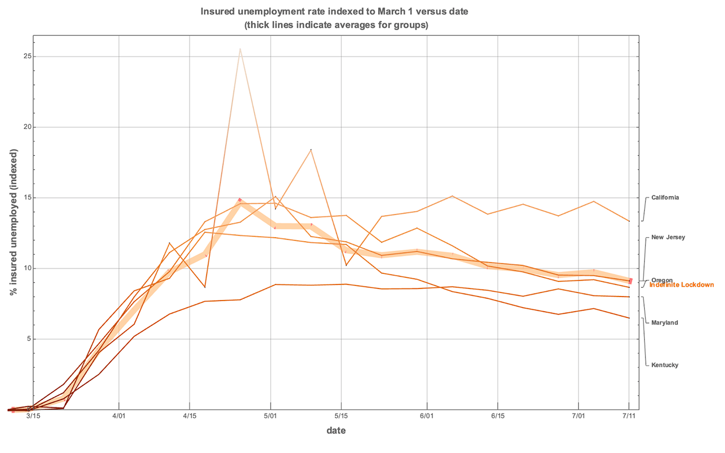
Next let’s look at states that had the shortest lockdowns, less than or equal to 30 days in length. Note that the shortest lockdown in this category was Mississippi, at 24 days. Georgia is the clear outlier by mid-July, with an insured unemployment rate of 15.4% (indexed) and 16% (unindexed).
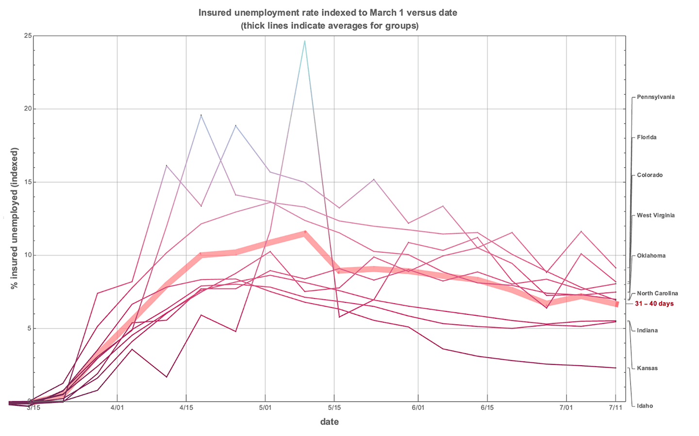
Next we look at lockdowns between 31 and 40 days. Idaho is clearly an outlier, pulling the average of this group down. Idaho’s insured unemployment rate is only 2.3% (indexed) and 3.7% (unindexed).
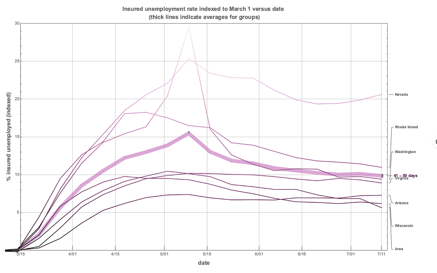
Next we look at lockdowns between 41 and 50 days. Nevada is way above the rest of the pack, which isn’t too surprising, given that its GDP strongly depends on tourism and that is one of the hardest hit sectors at the moment. Nevada’s insured unemployment rate is 20.6% (indexed) and 22% (unindexed).
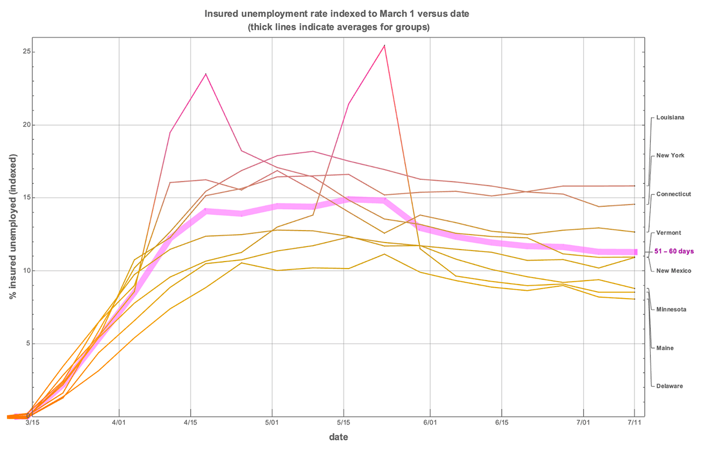
Next we look at lockdowns between 51 and 60 days. There isn’t a lot of variation within this group. Note that both New York and Louisiana are in this group and have similar insured unemployment rates, even though New York was hit a lot harder by the coronavirus than Louisiana during the first wave. New York’s insured unemployment rate is 14.5% (indexed) and 16.3% (unindexed), and Louisiana’s insured unemployment rate is 15.8% (indexed) and 16.6% (unindexed).
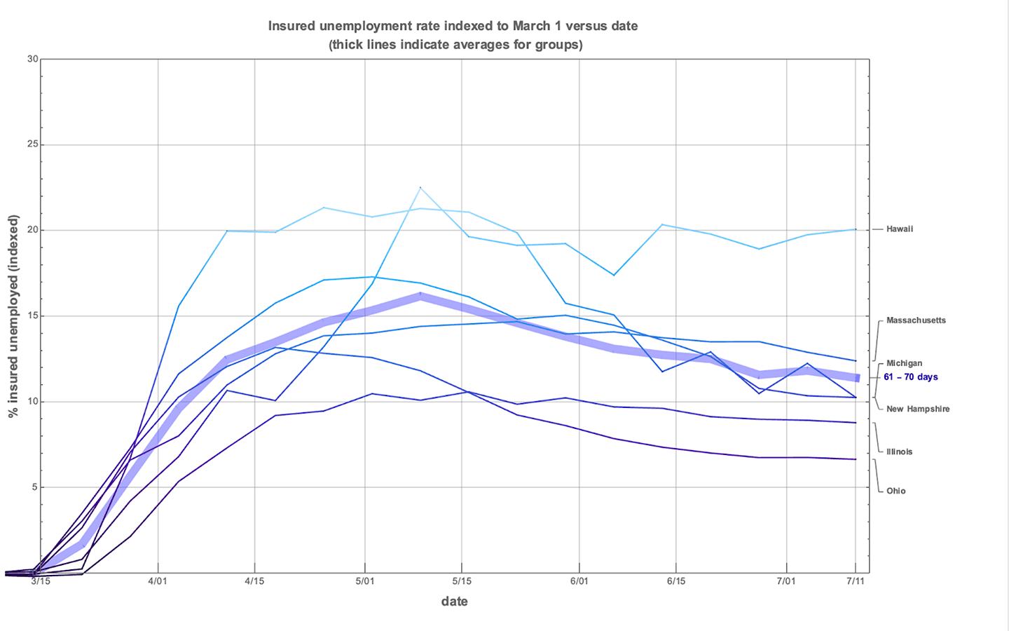
Next we look at the longest category of lockdowns, those that ran from 61 to 70 days. Like Nevada, tourism-dependent Hawaii was affected relatively negatively, with its insured unemployment at 20.1% (indexed) and 21% (unindexed). This group contains a lot of states who were hit differentially. Massachusetts was hit far harder by the coronavirus than its neighbor New Hampshire, even though both states have fairly similar insured unemployment rates by mid-July, with Massachusetts’s insured unemployment rate at 12.4% (indexed) and 14.5% (unindexed), and New Hampshire’s insured unemployment rate at 10.25% (indexed) and 10.9% (unindexed).
What I take away from these graphs is three-fold:
- States relatively dependent on the service sector were hit hard, particularly if they also had lengthy lockdowns. Nevada, Hawaii and Florida depend on tourism for a large chunk of their GDP, and Florida has done well relative to Nevada and Hawaii, which are both more than 10 percentage points worse in terms of their insured unemployment rates. Florida’s lockdown was 32 days while Nevada’s was 44 days and Hawaii’s was 67 days.
- Within-category comparison of states with very different coronavirus severity is telling. New York was locked down for 56 days and Louisiana for 53 days, but New York’s virus spread was much more severe during the first lockdown than in Louisiana. Yet, they have similar insured unemployment rates relative to March 1. Similarly, Massachusetts and New Hampshire both had lockdowns of 65 days but were very different in terms of virus spread, with the coronavirus hitting Massachusetts much harder than New Hampshire. Yet, both have relatively similar insured unemployment rates relative to March 1.
- Second lockdowns, such as those in California and Texas, will be further telling in terms of their individuated effect on the economy. I expect to write yet another of these articles a month or two from now, using new data that can help us suss out the effects of voluntary versus involuntary reduction in consumption and production even more precisely.
Abigail Devereaux

Abigail is an incoming research fellow at the Institute for the Study of Economic Growth and assistant professor of economics at Wichita State University