Don’t Let Hospitalization Trends Blind You to the Numbers Themselves


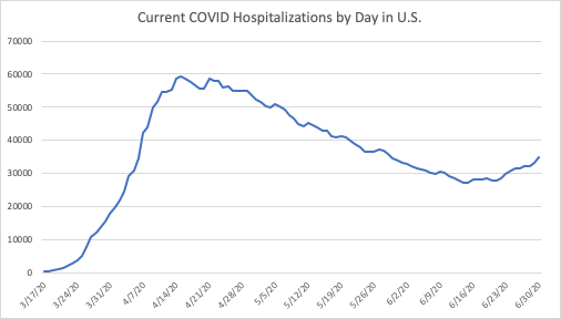
Since I wrote about hospitalizations two weeks ago, the trend in current hospitalizations has reversed, with more COVID hospitalizations now than there were a month ago, although still well below the peak in mid-April.
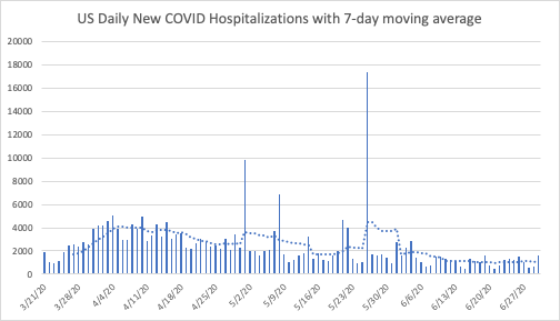
The trend in new hospitalizations nationally, is still flat, as the next chart shows. Not only is the recent trend flat, but the current weekly average of new hospitalizations is lower than it was one, two, and even three months ago.
So what do these trends mean? How can the number of people currently hospitalized for COVID be rising while the number of new hospitalizations stays relatively low?
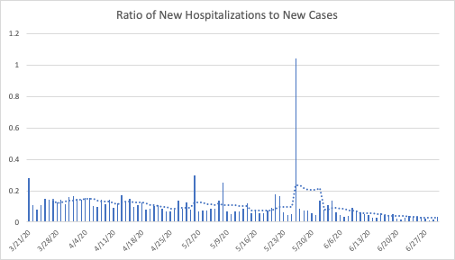
One answer is that hospital stays must be getting longer. If the increase in cases is picking up how infection is spreading, then the hospitalization data can help us see how serious those cases are. Looking at the ratio of new hospitalizations to new cases suggests that fewer of those infected need to be hospitalized.
The chart below indicates that the ratio of hospitalizations to infections is roughly a quarter of what it was in mid-April. This presents an even more complex puzzle: More people are currently in the hospital with COVID, but new hospitalizations are relatively low with a flat trend over the past few weeks. And on top of that, a smaller portion of those infected need to be hospitalized. And deaths continue to fall. The virus appears to be spreading as quickly as ever, but with fewer new hospitalizations and deaths, and longer hospital stays.
To understand how that may be happening, we need to disaggregate the data a bit, and examine how the trends in hospitalizations differ across the states.
Comparing Hospitalizations at the State Level
The table below uses four basic categories of states based on their hospitalization data and based on where their current numbers are relative to mid-April: Increasing trend, decreasing trend, flat trend, and insufficient data.
Currently 14 states have increasing trends, several of which were showing flat trends a few weeks ago. 24 states and the District of Columbia show clear downward trends, and eight have essentially flat trends. Of those eight, some could be categorized as increasing, but in those cases the number of hospitalizations have stayed low (often in or near the single digits) such that they could be considered “flat near zero”.
Montana, for example, had 21 COVID hospitalizations on April 15th and currently has 12. On May 15 Montana had 3 COVID hospitalizations. The numbers are so small that no trend is identifiable. The same is true for Alaska, North Dakota, and Wyoming.
| States with Increased Hospitalizations Since Mid-April | States (including D.C.) with Decreased Hospitalizations Since Mid-April | States with Flat Hospitalization Trends | States with Insufficient Data |
| 1. Alabama 2. Arkansas 3. Arizona 4. California 5. Georgia 6. Kentucky 7. Minnesota 8. Mississippi 9. North Carolina 10. Nevada 11. South Carolina 12. Tennessee 13. Texas 14. Utah | 1. Colorado 2. Connecticut 3. D.C. 4. Delaware 5. Iowa 6. Illinois 7. Indiana 8. Louisiana 9. Massachusetts 10. Maryland 11. Maine 12. Michigan 13. Missouri 14. New Hampshire 15. New Jersey 16. New York 17. Ohio 18. Oregon 19. Pennsylvania 20. Rhode Island 21. Virginia 22. Vermont 23. Washington 24. Wisconsin 25. West Virginia | 1. Nebraska 2. North Dakota 3. Montana 4. Alaska 5. New Mexico 6. Oklahoma 7. South Dakota 8. Wyoming | 1. Florida 2. Hawaii 3. Idaho 4. Kansas |
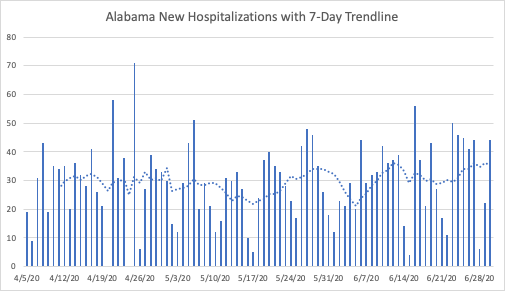
Among the states with increasing trends, the current and new hospitalization data are sometimes contradictory. As of June 30th, Alabama had 776 current hospitalizations, which is certainly more than that figure likely was in mid-April or even mid-May; the current hospitalizations do not go back that far for Alabama. The level of new hospitalizations has been around 30 per day since April. The seven-day average is slightly higher than it was a week ago, but roughly the same as it was a little over two weeks ago.
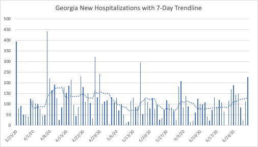
Georgia’s current hospitalization goes back a bit farther than Alabama’s, but not back to mid-April. Because of Georgia’s steady increase in current hospitalizations for the past two weeks, it seems likely that its current hospitalizations are higher than they were ten weeks ago. Similar to Alabama, new hospitalizations seem relatively flat, near their levels in both mid-May and slightly lower than their levels in mid-April.
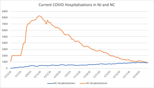
Other states have clear upward trends, such as North Carolina. But it is important to keep the magnitudes on the vertical axes of these charts in mind. North Carolina’s current hospitalizations, below, give the impression of a strong upward trend. The next chart puts that trend in perspective, by comparing hospitalizations in North Carolina (population of 10.5 million) to those of New Jersey (population of 8.9 million).
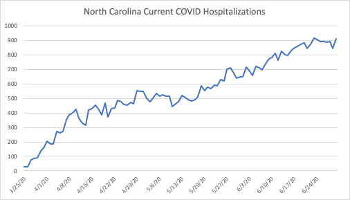
While the above chart suggests a sharp increase in hospitalizations, the comparison to New Jersey below makes North Carolina’s increase appear gradual, as though they have successfully “flattened the curve.”
A similar comparison can be made between Texas (population of 29 million) and New York State (population of 19.5 million):
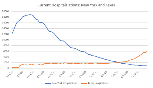
Despite the rapid increase in hospitalizations in Texas and its 30 percent larger population, it currently has a third of the people hospitalized today as New York did in mid-April. The trend in Texas is concerning, and worth watching closely. The reason to watch the trend is to guard against overwhelming the health care system’s capacity. Surely New York came very close to doing just that, but it seems unlikely that Texas is close to exceeding its available resources at the moment.
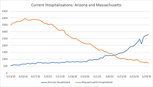
Arizona has seen an increase in the past few weeks that is comparable to Texas. When compared to Northeastern states, Arizona’s population of 7.3 million is closest to Massachusetts at 6.9 million. Given its trend, Arizona may well see hospitalization numbers similar to Massachusetts.
At the moment, though, it has roughly 1,000 fewer current hospitalizations than Massachusetts did at its peak. Similar to Texas, public health officials should monitor current hospitalizations as they consider ways to temporarily increase their capacity for treatment.
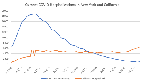
According to the COVID Tracking Project (CTP), 4 states do not report current hospitalizations. California, on the other hand, does not report cumulative hospitalization numbers to the CTP. Nonetheless, we know that California’s current trend, despite its much larger population of 39.5 million, is very gradual compared with New York’s. Comparing their current hospitalizations suggests that California has “flattened the curve” despite its large population and major metropolitan centers.
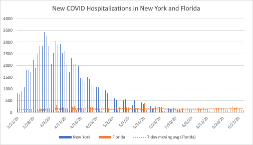
Florida, as one of the four states without current hospitalization numbers, can only be compared to other states on the basis of daily new hospitalizations. Florida’s population, at 21.5 million, is 10 percent larger than New York’s. Similar to other states currently seeing an increase in cases, the overall trend is much flatter than states with slightly smaller populations in the Northeast.
In all of the states that have seen an increase in hospitalizations since April, the absolute numbers are much smaller than states with similar (or in some cases much smaller) populations. More importantly, the trends are flatter, generally with more gradual increases over a much longer period of time, which is precisely what stay-at-home orders and school and business closures were intended to accomplish.
I focused on hospitalizations because they are the most relevant measure when it comes to the stated goals of preventative measures, i.e. to “flatten the curve.” The objective behind prevention is to slow the spread of the virus, so that our health care providers and facilities would not be overwhelmed.
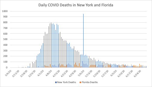
However, the data on COVID deaths are an important consideration. Deaths in most states with growing case numbers are still relatively flat. Similar to the hospitalization numbers, the absolute numbers are much lower in the South and Southeast than they were in the Northeast. In fact, the deaths are quite a bit lower in some cases. New York currently has very low death numbers, but they are similar to Florida’s as seen below.
Overall, to the extent that people in the South and Southeast appear to not be taking COVID’s spread as seriously as people in the Northeast, it is because the pandemic is not as serious in those states. The absolute numbers of hospitalizations and deaths are much lower, and the spread of the virus has been much slower.
Debating Differences
An obvious response to the comparisons above is to note that while New York, New Jersey, Massachusetts, and other Northeastern states may be comparable to Florida, North Carolina, Georgia, Arizona, and Texas in terms of population, they are much different in other ways. New York obviously has a much greater population density than Texas or Florida.
That is the point of making the comparisons, to highlight the fact that these differences matter when it comes to COVID’s impact. Population density, demographics, and a number of other differences have slowed the spread and lessened the virus’s impact on those states. It cannot be argued that the policy response has been more strict in those states or that the residents have been more vigilant.
Some may speculate that warmer weather or higher Vitamin D levels are part of the story. What is obvious is that states in the South have characteristics that make it harder for COVID to spread. It may just be the luck of having had exposure to similar viruses that enhance their residents’ immune response to the virus. It may be that by the time the virus started to spread quickly in these areas that it has evolved to become less deadly. Those are medical research questions to be settled later.
What we can see clearly from the trends around the world is that the virus’s impact has been very uneven, and massive outbreaks like those experienced in Italy and New York are not inevitable, and seem to have little to do with how local government addressed the pandemic. The states discussed above have all eased restrictions to different degrees on different timelines, yet the ones with the strictest policies are not systematically better off than those with the least restrictions.
So what about the puzzle of how current hospitalizations can increase while new hospitalizations remain flat and deaths continue to decline? As Peter C. Earle pointed out recently infections have tended to grow more quickly among younger people recently. Many of those young people still seek treatment, although their symptoms are less severe than they tend to be for older patients. And we know that medical facilities have an incentive to increase their counts of COVID hospitalizations.
Since the virus is far less deadly among younger people, even when large numbers are infected deaths can continue to fall. Those who are hospitalized are more likely to live, which combined with better treatment protocols can increase the number of people living in the hospital at a given point in time. As more of those people recover, the virus’s impact is lessened even further.
*The data used in this article were downloaded from The Atlantic’s COVID Tracking Project on July 1st, 2020.
Stephen C. Miller

Stephen C. Miller is the Adams Bibby Chair of Free Enterprise and an Associate Professor of Economics in the Manuel H. Johnson Center for Political Economy at Troy University. He is also an AIER Summer Fellow alumnus and Voting Member of AIER. The views and opinions expressed are those of the author and do not imply endorsement by Troy University.